Next.js Performance Optimization: Scaling from 50 to 99 Lighthouse Score
In modern web development, “speed” isn’t just about user experience—it’s the lifeline of SEO rankings and conversion rates. Many developers build Next.js sites with powerful features and stunning UIs, only to find their Lighthouse scores abysmal and their performance on low-end devices sluggish.
Specifically, LCP (Largest Contentful Paint) and CLS (Cumulative Layout Shift) are often the biggest pain points for Next.js applications.
Forget dry theoretical concepts. Today, we’re going straight into a battle-tested optimization toolkit designed specifically for the Next.js framework. Let’s see how to take a 50-score site to 90+.
1. The LCP Killer: Advanced Image Loading Strategy
LCP measures the render time of the largest content element in the viewport. For most e-commerce or blog sites, this is the Hero Banner or the main product image.
❌ Common Pitfalls
- Blind Lazy Loading: Adding
loading="lazy"to your hero image. While it sounds like an optimization, it’s a mistake. The browser waits until it’s certain the image is in the viewport before fetching, wasting precious parallel download time. - Default
<img>Tags: Lackingsrcset, leading mobile devices to download 4K-resolution images meant for desktops.
✅ The Solution: Priority and Sizes
The Next.js <Image> component is an optimization powerhouse—if you know how to use it.

<div className="relative h-[500px] w-full">
  <Image
    src="/hero-banner.png"
    alt="Hero Banner"
    fill
    style={{ objectFit: 'cover' }}
    priority={true}        // Optimization 1: LCP Booster
    sizes="(max-width: 768px) 100vw,
           (max-width: 1200px) 50vw,
           33vw"            // Optimization 2: Demand-based DL
    quality={85}           // Optimization 3: Quality/Size Balance
    placeholder="blur"      // Optimization 4: Visual Stability
    blurDataURL="data:image/..."
  />
</div>
Deep Dive:
- priority={true}: This adds the
fetchPriority="high"attribute to the<img>and generates apreloadlink in the<head>. It tells the browser: “Forget the JS for a second, download this image first!” This has an immediate impact on LCP. - sizes: Many developers specify width and height but ignore
sizes. Thesizesattribute tells the browser how wide the image will be at different screen widths. Combined with Next.js’s auto-generatedsrcset, the browser can intelligently download a 300px thumbnail or a 1024px hero image based on the device.
2. The CLS Killer: next/font and Layout Stability
Have you ever opened a page and seen the text start as a default system font (like Times New Roman) before suddenly snapping into your custom brand font 0.5 seconds later? Or worse, the text is invisible for a split second?
These are FOUT (Flash of Unstyled Text) and FOIT (Flash of Invisible Text). They don’t just look bad; they cause content height shifts, triggering Layout Shifts (CLS).
✅ The Solution: next/font
next/font is a killer feature introduced in Next.js 13. It automatically downloads Google Fonts (or local fonts) at Build Time and inlines the font files and CSS directly into your project.
This means: Zero external requests to fonts.googleapis.com. Your fonts arrive with your HTML.
Even more impressive is its adjustFontFallback capability.
import { Inter, Lora } from 'next/font/google';

const inter = Inter({
  subsets: ['latin'],
  display: 'swap',
  variable: '--font-inter',
});

const lora = Lora({
  subsets: ['latin'],
  variable: '--font-lora',
});

export default function RootLayout({ children }) {
  return (
    <html lang="en" className={`${inter.variable} ${lora.variable}`}>
      <body className="font-sans antialiased">
        {children}
      </body>
    </html>
  );
}
Next.js automatically calculates the aspect ratio difference between the system font (Arial/Times) and your custom font (Inter/Lora). Using the CSS size-adjust property, it forces the fallback font to occupy the exact same space as the custom font. Even if the custom font is still loading, your layout won’t budge!
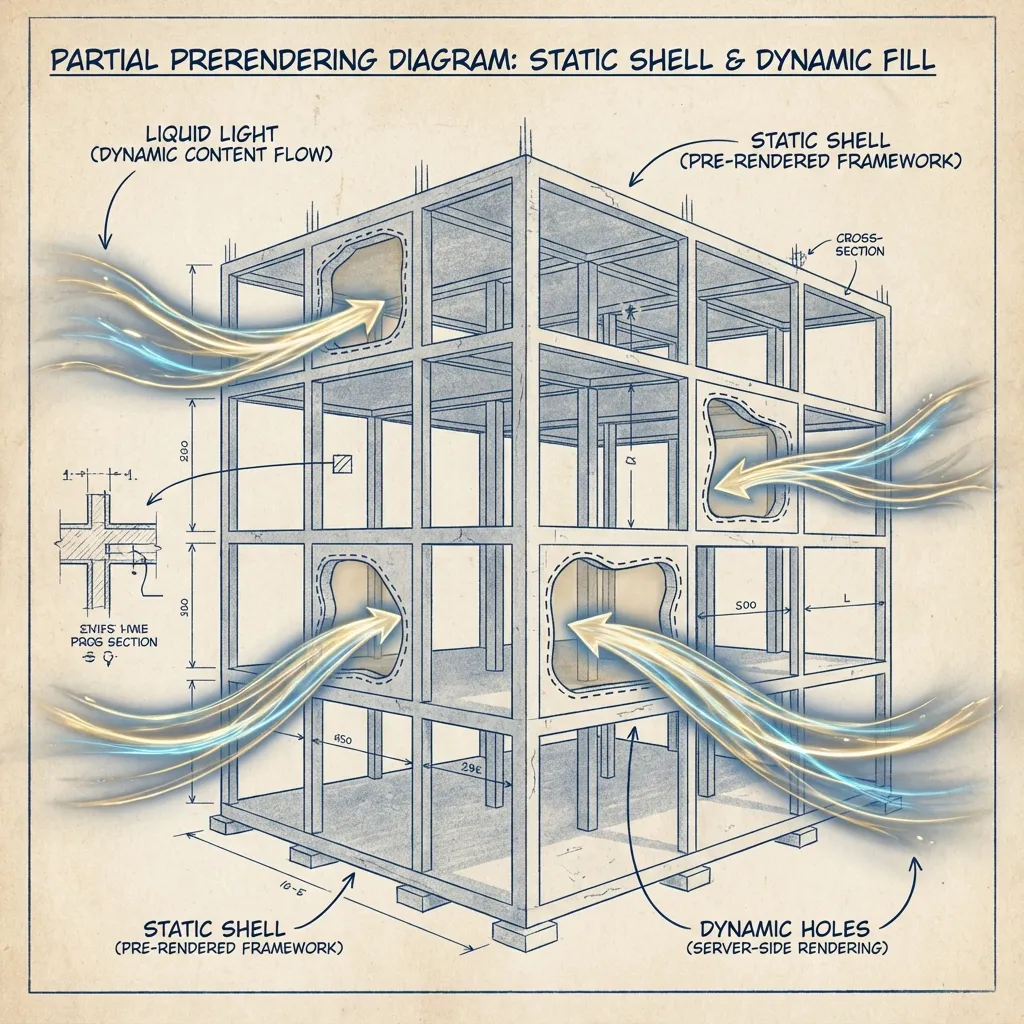
3. Architectural Optimization: Partial Prerendering (PPR)
While the previous steps are refinements, Partial Prerendering (PPR) is a fundamental architectural shift.
Before Next.js 14, we had to choose:
- Static (SSG): Blazing speed via CDN caching, but data is stale and non-personalized.
- Dynamic (SSR): Real-time, personalized data, but slow First Contentful Paint because the browser waits for the database query before returning HTML (High TTFB).
PPR allows you to mix both:
import { Suspense } from 'react';
import { ProductSkeleton } from './skeletons';
import { RecommendedProducts } from './recommendations';

// Page Shell: This is STATIC! Returns 200 OK instantly.
export default function Page() {
  return (
    <main>
      <h1>My Static Product Page</h1>
      <p>This part is static and served from CDN instantly.</p>

      {/* Dynamic Hole: This is DYNAMIC! */}
      <Suspense fallback={<ProductSkeleton />}>
        {/* React component containing 'await db.query()' */}
        <RecommendedProducts />
      </Suspense>
    </main>
  );
}
With PPR enabled, the server immediately returns the static shell (Navbar, Footer, static copy, and skeletons). The browser starts rendering immediately—LCP is nearly zero. Simultaneously, the server begins rendering the dynamic components (Stream) and pushes them to the browser as they become ready via HTTP Streaming to fill the “holes.”
This is the ultimate evolution of web performance.
4. Solving the Third-Party Script Nightmare
We often need Google Analytics, Meta Pixels, or chat widgets. These third-party scripts are often bloated, slow, and block the main thread.
The Next.js <Script> component provides the strategy attribute to manage load timing.
import Script from 'next/script';

// strategy="afterInteractive" (Default): Load immediately after hydration (GA)
<Script src="https://www.google-analytics.com/..." />

// strategy="lazyOnload": Load during browser idle time (Chat widgets)
// This significantly reduces TBT (Total Blocking Time)
<Script
  src="https://chat-widget.com/..."
  strategy="lazyOnload"
/>

// strategy="worker" (Experimental): Offload script execution to a Web Worker
// Completely off the main thread—perfect for heavy computation logic
<Script
  src="..."
  strategy="worker"
/>
5. Trimming the Fat: @next/bundle-analyzer
Sometimes your JS bundle blows up simply because you accidentally imported a massive library (e.g., the entire lodash instead of lodash/get).
Running a bundle analyzer regularly is a must.
- Install:
npm install @next/bundle-analyzer - Configure
next.config.js:const withBundleAnalyzer = require('@next/bundle-analyzer')({ enabled: process.env.ANALYZE === 'true', }); - Run:
ANALYZE=true npm run build
You’ll see a colorful treemap. Focus on the largest squares.
- Tree Shaking: Ensure you use named imports for only what you need.
- Dynamic Import: For heavy components not needed on first paint (e.g., Rich Text Editors, 3D viewers), use
next/dynamicfor lazy loading.
const HeavyChart = dynamic(() => import('./HeavyChart'), {
  loading: () => <p>Loading Chart...</p>,
  ssr: false, // Turn off SSR if SEO isn't needed to further reduce HTML size
});
Summary
Performance optimization isn’t an art; it’s a respect for the browser’s rendering mechanism. Remember three rules:
- Prioritize the Critical Path (LCP / Priority / Preload).
- Reserve Space (CLS / Fonts / Aspect Ratios).
- Don’t Block the Main Thread (Script Strategy / Web Workers).
Master these, and your Next.js application won’t just hit a high Lighthouse score—it will provide a silky-smooth experience for every user.